Every business needs a website — that’s common knowledge. But getting there can be tricky: there are lots of options for building a website, it takes time, and it takes money. Sometimes a lot of money.
We think the best way to create something great is to get inspiration from others, and websites are no exception. What sites do you go to often? What do you like about them? What drives you crazy? (Answer: popups. Always popups!) How can you make an element work for your business or site?
Below are just some of our favorite websites and you can find a list of 20 beautiful sites on Hubspot’s blog as well.
Tessemaes

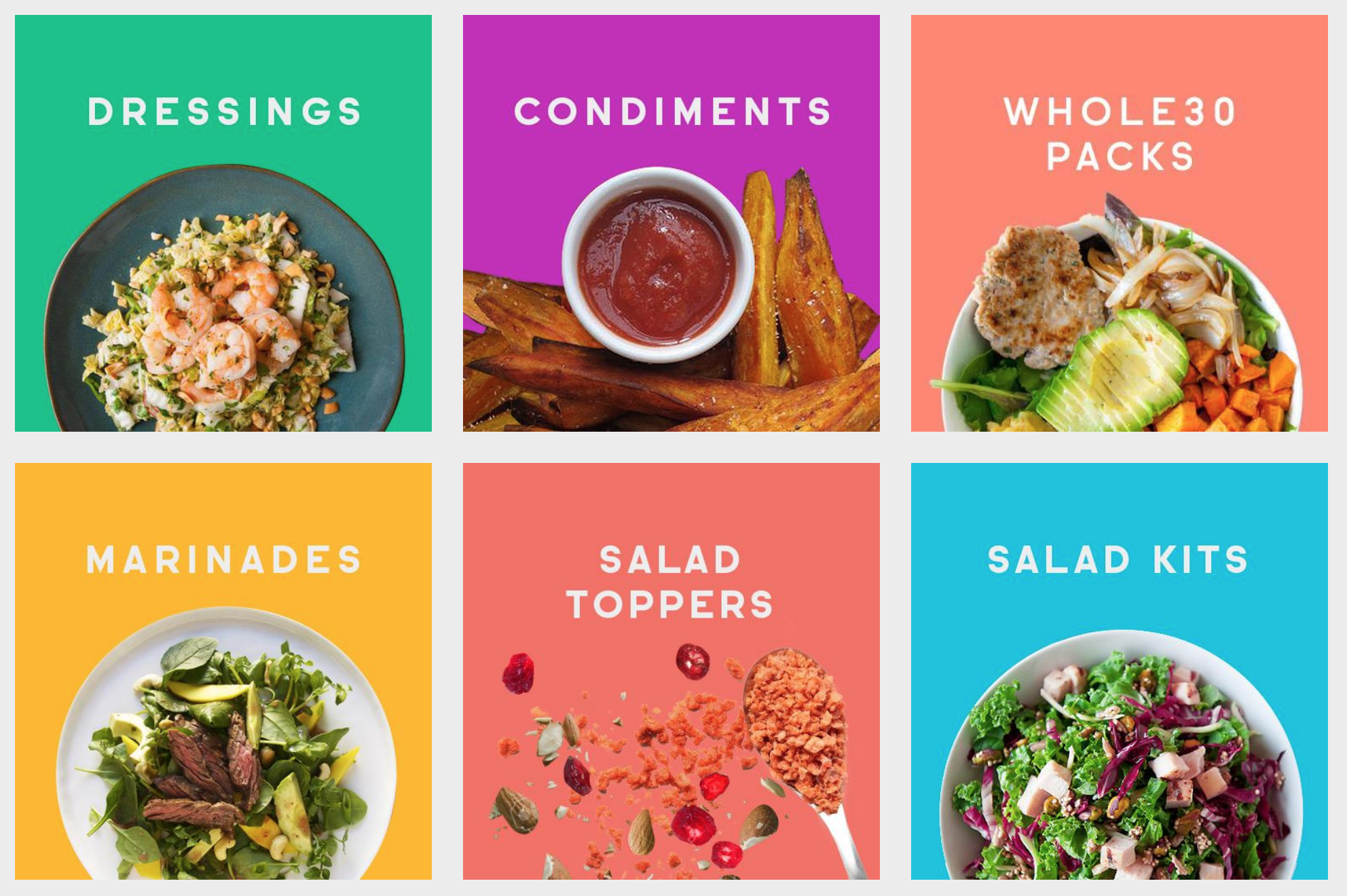
We love Tessemaes’ site not only because it’s visually appealing, but it’s also FUN! Their homepage carousel has bright, vivid colors and engaging images and text. Their “Shop” tab is exactly the same — somehow, they made salad dressing and marinades look cool!
Conde Nast

It’s hard to tell how cool Conde Nast’s site is just from this screenshot, because they have multiple videos on their homepage as users scroll down. The videos are teasers for the content pages, which are almost all images and videos. Though there is almost no text at all, it works well!
MINDBODY

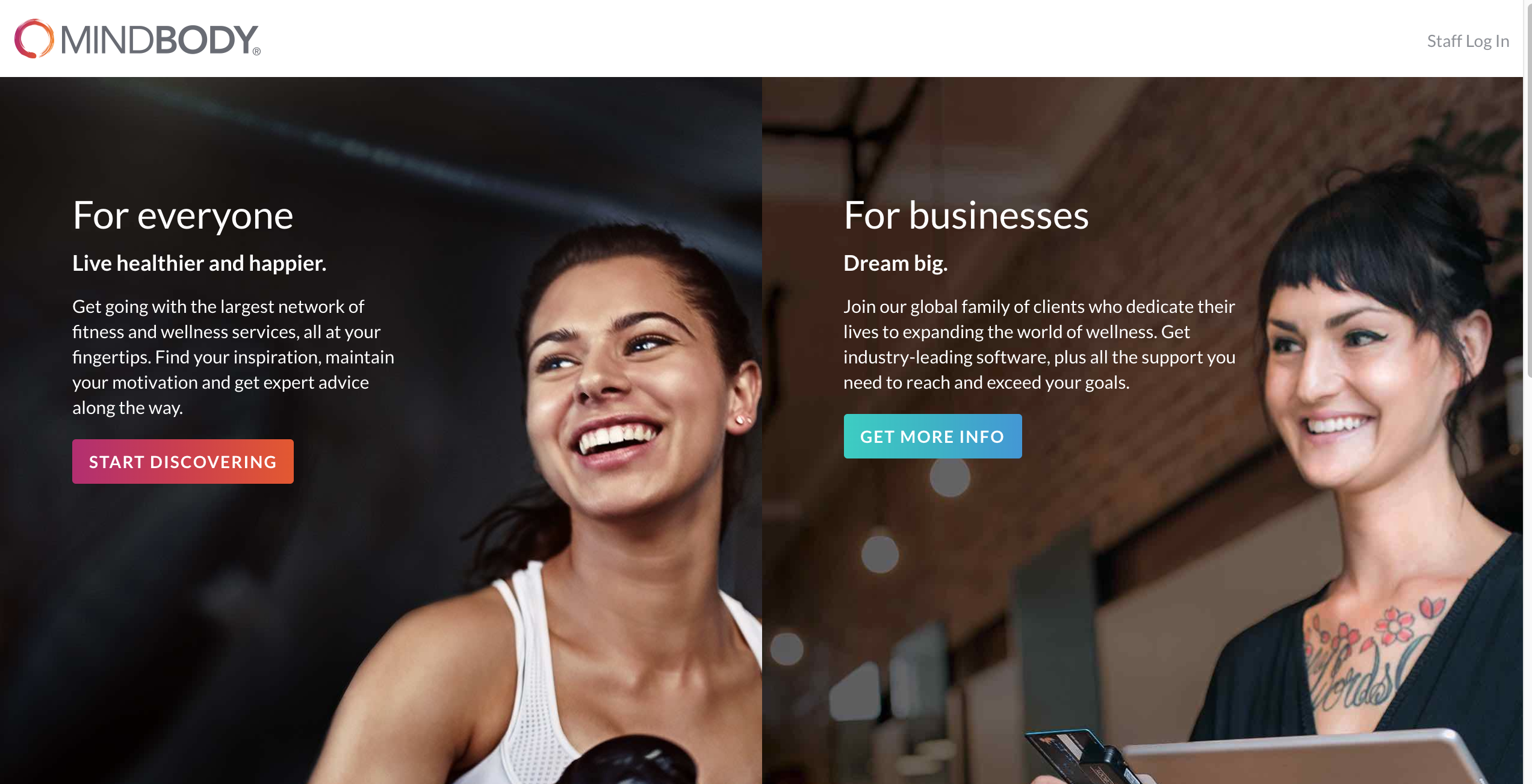
MINDBODY uses a great combo of text and images. This page, the homepage, sends users directly to the right page for them instead of having to scroll through a lengthy menu or find the page manually. The “Start Discovering” page is even fancier, with an interactive description of the MINDBODY app. It convinced us to try it, so job well done!
Fabletics

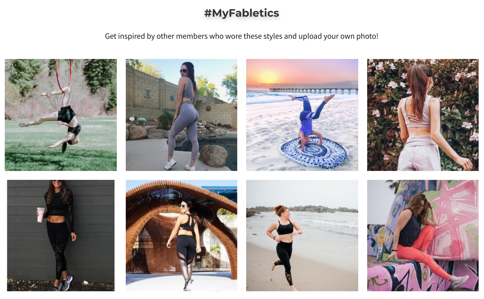
What we love about Fabletics website is the use of UGC. (Wondering what UGC is? It’s communications shorthand for user generated content.) Fabletics pulls images from Instagram and includes them on the site, which is not only good content, but it’s also great for engaging current customers and potential customers.
Stand Up Republic

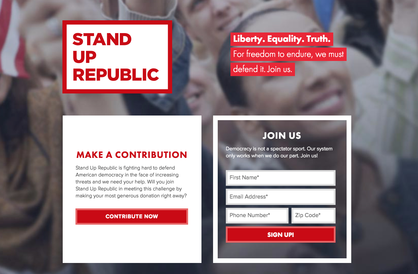
Can you guess what Stand Up Republic is from the homepage? Yep. Although it only has 3 sentences of text, it explains exactly what Stand Up Republic is and what they want from website visitors — money and engagement. If their goal is fundraising, having a donation ask smack dab on the homepage is the best way to make that happen. Using basic, simple layout works great for this organization.
Pin this for later 📌


Be the first to comment